Introducing the Newest Theme Feature from Android - Material You
The newest software update for Android was released last month - Android 12. Android users had remarks regarding the past couple of software updates, saying that not much creativity was brought into the operating system.
Fortunately, the developers listened. When Android 12 rolled out, the visual redesigning of the OS was something truly different from what Android users were used to before.
Introducing Material You
The “Material You” feature is offering truly amazing ways for users to customize the theme of the whole software. Google stated that a “humanistic approach” was what they were going for, when the development of Material You took place. The main feature that Material You offers, the color extraction, is that the theme of the system is changing based on the wallpaper you set.
The two basic colors of the wallpaper are selected, and the system of your Android changes accordingly, with shades of lighter and darker of the selected 2 colors.
What makes this even better is that you can switch these colors manually, meaning in your “Settings”, you will have a palette of colors to choose from - and make your whole system design more enjoyable than ever.
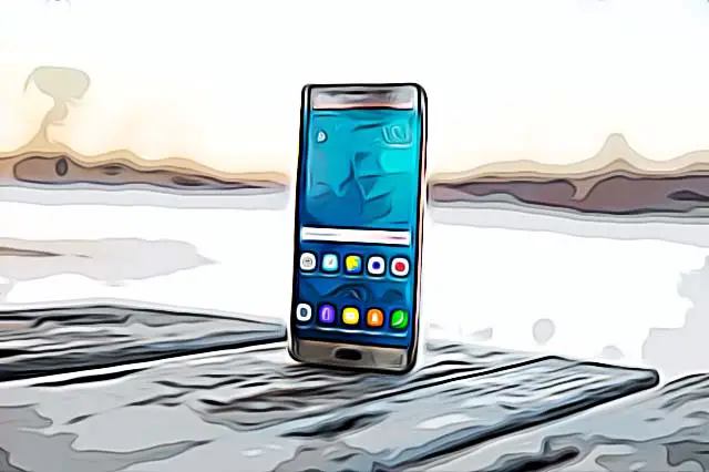
If you’re using a background with predominantly blue colors, the system design is bound to switch to blue and lighter/darker variations of blue. You will get themed icons based on the color palette you’ve chosen. The clock, calculator, widgets, icons, notifications shade, and sliders also change colors each time a wallpaper is changed, making your whole screen look dynamic.
Some changes were made to the font as well, and Google said they were planning on integrating these changes in all Google Apps - such as Gmail.
These drastic changes to the home screen took place probably because of the launching of iOS 12, which had huge changes in the widgets and the look of the whole system. Android however, for the past couple of years, didn’t have such grand changes, so the Material You part is where they really stepped up their game, making these features more dynamic than ever.
In case you do not want Material You to keep adjusting based on the wallpapers you’ve set, you can switch it to static colors. This feature is located in “Settings” - “Wallpaper and Styles”, and you can choose from four predominant colors.
Creating your own Material Theming

Even though the Material You design is truly well constructed, it only allows you to choose from four colors. So, if your favorite color is not one color you can choose from, you will have to adapt your system based on the wallpaper you will choose.
Explore: How to Back Up Phone Before Factory Reset [Android 2022]
Choose whether you want the color of your icons to change
You can also choose whether you want the icons to keep changing colors based on your wallpapers or not. Bear in mind that only the icons that have been redesigned with Android 12 will be changing. All other apps will keep their old looks.
Light/Dark mode in Android 12
As with the several previous software updates, Android 12 devices come with an option for Dark Mode. If you decide to switch to Dark Mode, the same features will keep applying, Material you works in the same manner - changes based on your wallpaper, or you choose from the palette of four basic colors. Another addition to the Light/Dark Mode, is that there can be changes between these two based on the timings of the sunrise/sunset in the area you live in (approximate location).
How widgets changed with the new Android 12
The widgets had some changes in their design as well. One of the changes are the more dynamic colors, the changes made based on the wallpapers, and the design in general is improved and much more appealing than what Android users were used to seeing.
As we mentioned, not all widgets were part of the design changes - some third-party apps will not be receiving any changes with the newest update. If you want to make changes to these icons, there are apps you can purchase, so you can redesign the icons yourself. (Google Play - KWGT - Kustom Widget Maker)
Check out also: How to Connect AirPods to an Android Device and Reinstate Some Features.
